FamCare
A Mobile Check-in App
PROJECT - 2023
SCOPE
November - December 2023 (2 Weeks)
ROLE
Solo student project for Google UX Design Course
TOOLS
Figma, Google Doc
PROBLEM
Quite a lot of Families have been vocal about their frustration with the check-in process they have to undergo during their visits...
And they often encounter inefficiencies. Existing solutions lack the necessary simplicity needed for families to seamlessly schedule appointments, check-in, stay connected with their clinic and update their families information and personal details.
Goal
The goal of the project is to develop a user-centric family healthcare check-in and appointment scheduling apps that simplifies and enhances the healthcare management experience for families.
DESIGN PROCESS
RESEARCH : Summary
In conducting user research for the app, My initial assumptions was centered around the idea that check-in procedures were relatively straightforward. However, after engaging with families that visit their clinics through interviews, I discovered a nuance landscape. They expressed frustrations not only about the check in process but also how they were treated during the process. The research illuminated the multifaceted nature of user experiences, prompting a shift in focus to address the check-in procedure comprehensively within the app.
COMPETITIVE ANALYSIS
The competition all have the same arget audience and none focuses on the patients.
Although sites/apps like ClinicSense, MyBestPractice and Jane offer clinics and hospitals a seamless ability to manage patient records and ability to schedule appointments examine patients records and information, none provides the patient the ability to check in to their preferred clinics. FamCare has the opportunity to blend in the check-in process, schedule appointments and also fill and edit personal information provided the patients from the comfort of their phone.
The major features between these competitors were quite similar but the main differences I noticed were:
-
Easily Accessible vs Hardly Accessible
-
Outstanding interface Vs Outdated Interface
-
Specialized features vs Business centered features

INTERVIEWS
Taking the qualitative research approach, I sought out to speak directly with the families that experience the process during their doctor’s visit. Through a few interview questions, I identified these families based on the visit frequency to their doctors, experience during said visits and needs.
Specific Questions
-
Can you briefly tell me your process for checking in, scheduling and managing healthcare appointments for your family?
-
What’s your visit frequency with your family doctor like?
-
Are there specific features or functionalities you wished existed in a healthcare management tool or app to make your life easier?
INSIGHTS
81%
Frustrated about how they have to visit the clinic to schedule appointments and that sometimes they forget to visit
49%
Visits their family clinic once every two months.
100%
Use paperwork during their check-in
62%
Want a way in which they can check-in via their phone evading the need to wait at the front desk
EMPATHY MAPPING

MEET THE USERS: PERSONAS
While we already know what problem we are trying to solve, before moving to the stage of ideating, sketching and wireframing, it is important to know the potential users of the product and from their perspective understand what they truly need and what will make their life a lot more.
Adding to the research, User stories, personas and journeys helped me prepare for the wireframing process. Also using my little connection to some health practitioners, I decided to pick their brains on the day to day process of attending to patients and families and how they think the process can be a lot more seamless. This conversation helped me empathize much deeper with both the User and the health practitioners, understanding their experience and emotions.
This approach helped me gain insight which in turn helped in the creation of my personas for the App.
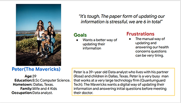
I was able to develop three personas from the insights I gathered during my research
Ella - The celebrity Esthetician
Mubarak- Everyone’s favorite chef
Mubarak- Everyone’s favorite chef


IDEATION: INFORMATION ARCHITECTURE
FamCare

WIREFRAMES
Moving into the ideation phase, I sketched different ways the features of the product should be laid out and how the users will interact with the product. I brainstormed various concepts, considering the needs of families, such as intuitive appointment scheduling, easy check-in procedures, and clear communication channels. After generating multiple ideas, I conducted feedback sessions with potential users to gather insights and refine my concepts further.
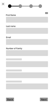
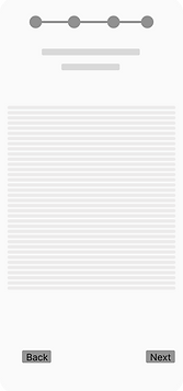
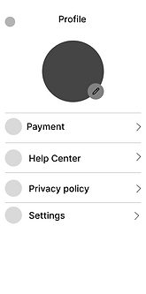
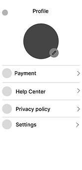
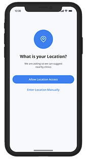
During the wireframing stage, I translated my ideation sketches into digital mockups using my preferred design tool. I focused on creating low fidelity wireframes to outline the basic structure and layout of the app’s key screens, including all the check-in process screens, appointment scheduling screens and notificatioin system. These wireframes served as visual guide for the app’s functionality and flow, allowing me to iterate rapidly and incorporate user feedback.
.png)
.png)
.png)
.png)
.png)
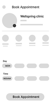

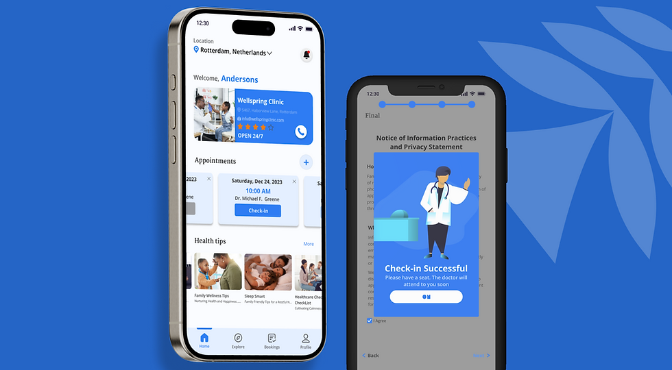
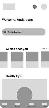
While focusing on a seamless experience of the check-in process on the app, I also designed the app so that users can browse, explore and search for their preferred clinic and book appointment immediately, as well as reading more on the clinic and even booking a phone call directly to the clinic.
I also made sure to include some familiar features like “Status” so users will feel more confident navigating the app. After booking appointments, I added the ability to cancel said appointments, directly on the home page and also on the ‘appointment’ screen, where users can see their past and forthcoming appointments.
TESTING + IMPROVEMENTS
Achieved major improvements in my design
Over the course of six days, I consistently refined my designs based on the feedback gathered from conducting usability tests, leading to significant improvements.
1
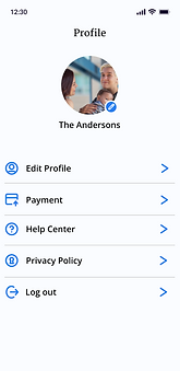
Edit Profile
-
Based on the insights, I made changed to the profile screen by adding a direct way for users to edit their profile
2
Log Out
-
Based on the insights, I also made changes by making it possible for users to log out after using the app.

HI FI DESIGN
The final product
.png)
.png)
.png)
.png)
DESIGN SYSTEM
Color
Typography
Martel
Open Sans
Used in Bold and medium and regular weights.
Iconography

Illustrations

Components


Grid and Spacing
8px layout grid
4 Colum grid / 16px margin
8Px Gutter
Link to my full figma work file here.
CONCLUSION AND WHAT I'VE LEARNED
Focusing mainly on the end users
FamCare being my first project opened up the urge in me to help people and help users navigate the world much easier. Famcare evolving from an idea to a potential solution has been a fulfilling journey. I’m excited and happy with the outcome of this project, having the opportunity to speak in depth with people and try to understand their needs and frustrations is something I want to continue to do. I believe this potential solution would be a gamechanger to the healthcare system, easing both the lives of the users and the healthcare practitioners.
Design Focusing on just the user is everything. This approach not only helped me understand the user but also helped in creating the product that they truly needed going beyond just my assumption to really connect with them and understand their pain points and desires. I have made it a must-do on every project I work on to prioritize the users and create a product that truly meets their needs.
fin.